Our comments on the first set of renders. Each point has a reference like 1.3, so you can reply to a point by its number. Colour tone of the cabinets is not covered here, we will settle that separately.
Dining and entry wall
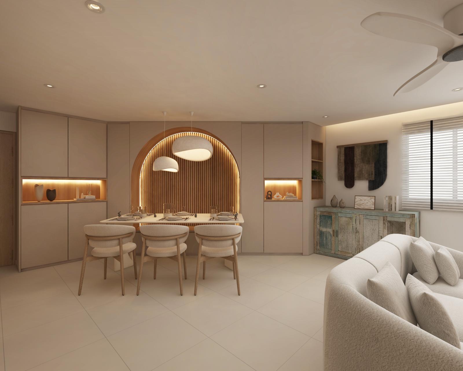
- 1.1
Consider swapping the seascape cabinet and the study table, so the study table sits under the window here.
- 1.2
If the study table moves here, can we build cabinets above it for books?
- 1.3
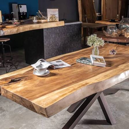
Dining table: we prefer a more irregular, organic shape in natural wood rather than the rectangular top shown.
- 1.4
The gap above the full-height cabinets looks odd, especially next to the arch wall which runs to the ceiling.
- 1.5
The fluted wood panel inside the arch looks like a lot of upkeep. What else could go there?
We are leaning towards a wabi-sabi feel: organic and natural rather than picture-perfect. The seascape cabinet already has that distressed look. A limewashed wall inside the arch is one idea.
Living room
- 2.1
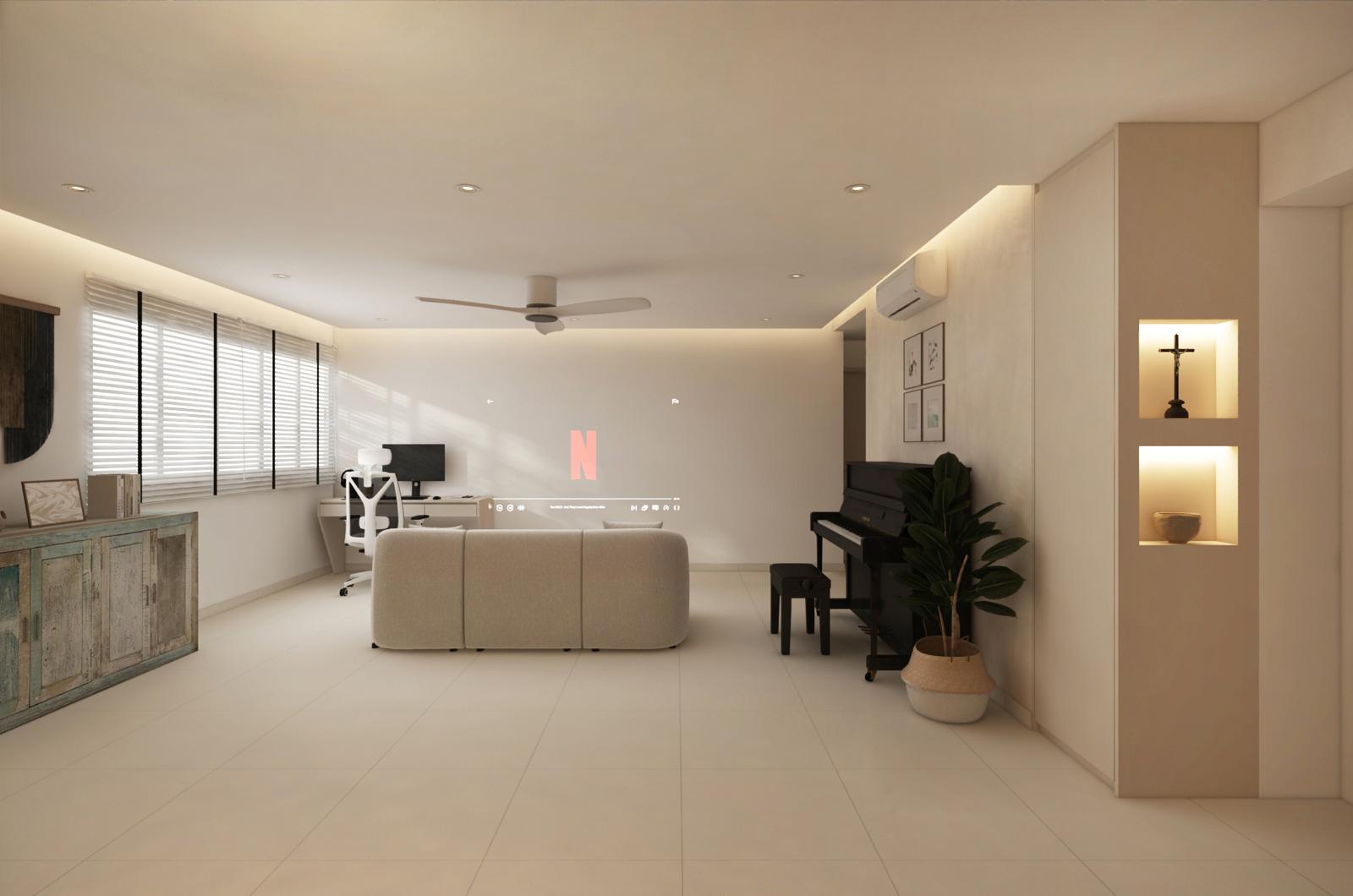
The study table looks out of place tucked in that corner. See 1.1 for moving it to the dining side.
- 2.2
Could the seascape cabinet, or the cabinet from the master bedroom, sit behind the sofa as a low divider between living and dining?
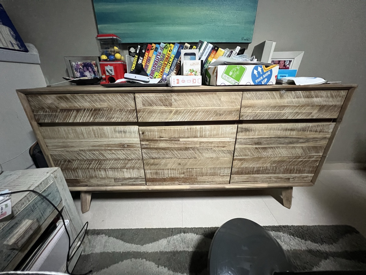
Master bedroom cabinet, 160 W × 45 D × 81 H cm. 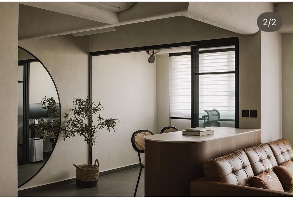
A console behind the couch that looks tasteful, from your own portfolio. - 2.3
The walkway between the sofa and the piano looks too tight. One fix is an asymmetrical feature wall, see 2.5.
- 2.4
Curtains instead of blinds, like the ones in the reference video in G.2.
- 2.5
The projector wall looks bare when the screen is off. Two directions we would like you to explore:
- A large painting on the wall, with a motorised screen that drops from the ceiling when we watch.
- A floor-to-ceiling feature wall with a set of doors as the centrepiece. Closed, the doors are the screen. Open, they reveal the painting.
If we go with the feature wall: enclosed cabinets either side of the centrepiece, a pull-out drawer for electronics, and a way to hide or reveal a soundbar or speakers.
Consider making the feature wall asymmetrical, with the screen and the sofa shifted towards the left side of the wall. That frees up walkway between the sofa and the piano (2.3).
Feature wall reel: no TV, a blank wall for the projector, and sliding doors styled to look like a painting when closed.
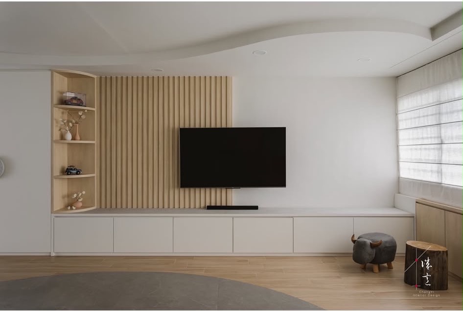
Half bare wall, half embellishment. Ours would have no TV, the projector takes its place. 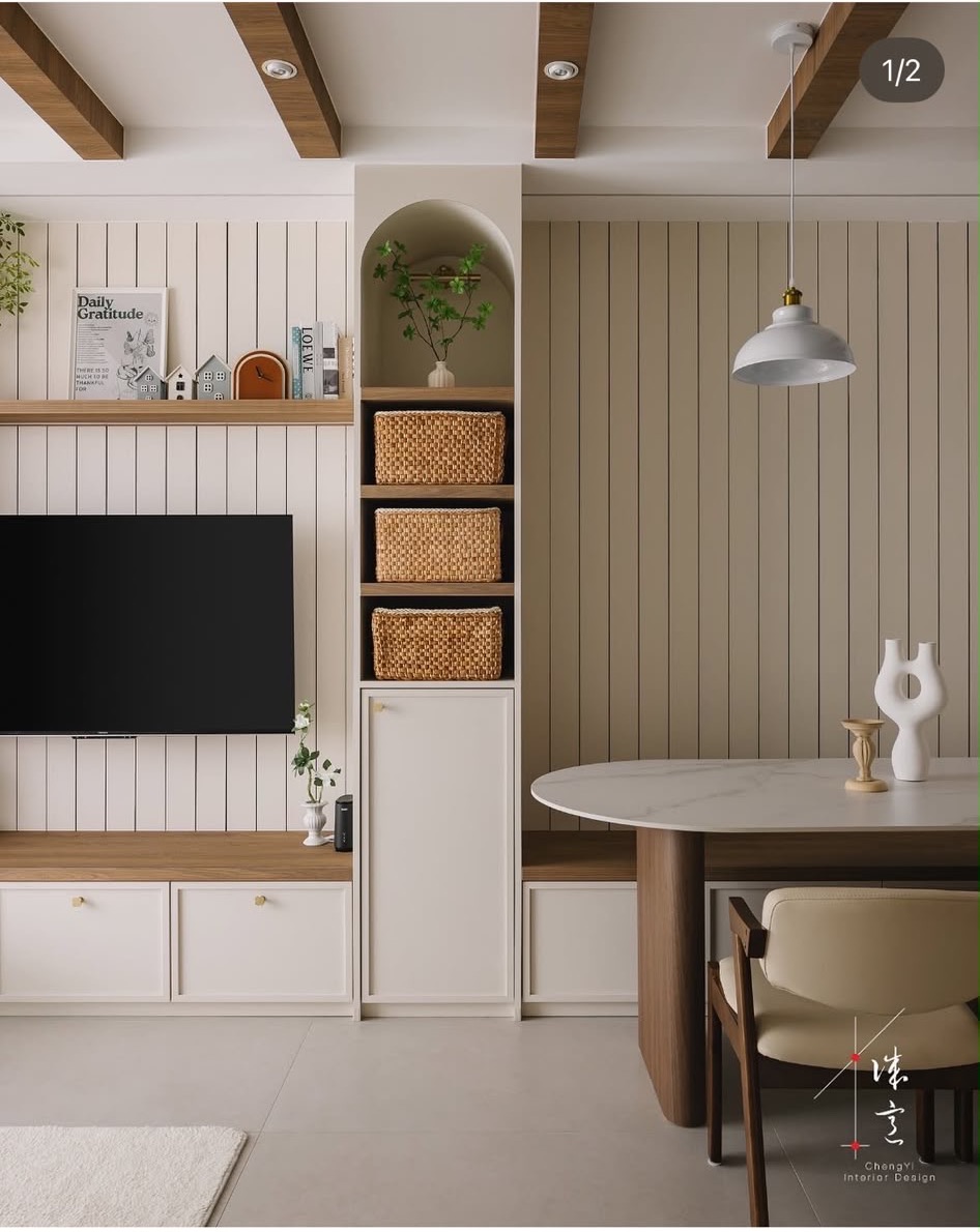
How the cabinetry and feature wall can be varied rather than one flat run. - 2.6
Where does the projector go?
- 2.7
The aircon sits directly above the piano. How do we access it for servicing, and what protects the piano if it leaks?
- 2.8
We want a proper statement tree, like the one in the reference video in G.2. Either in front of the piano, or in the window corner where the study table is now, for more light.
TV room
- 3.1
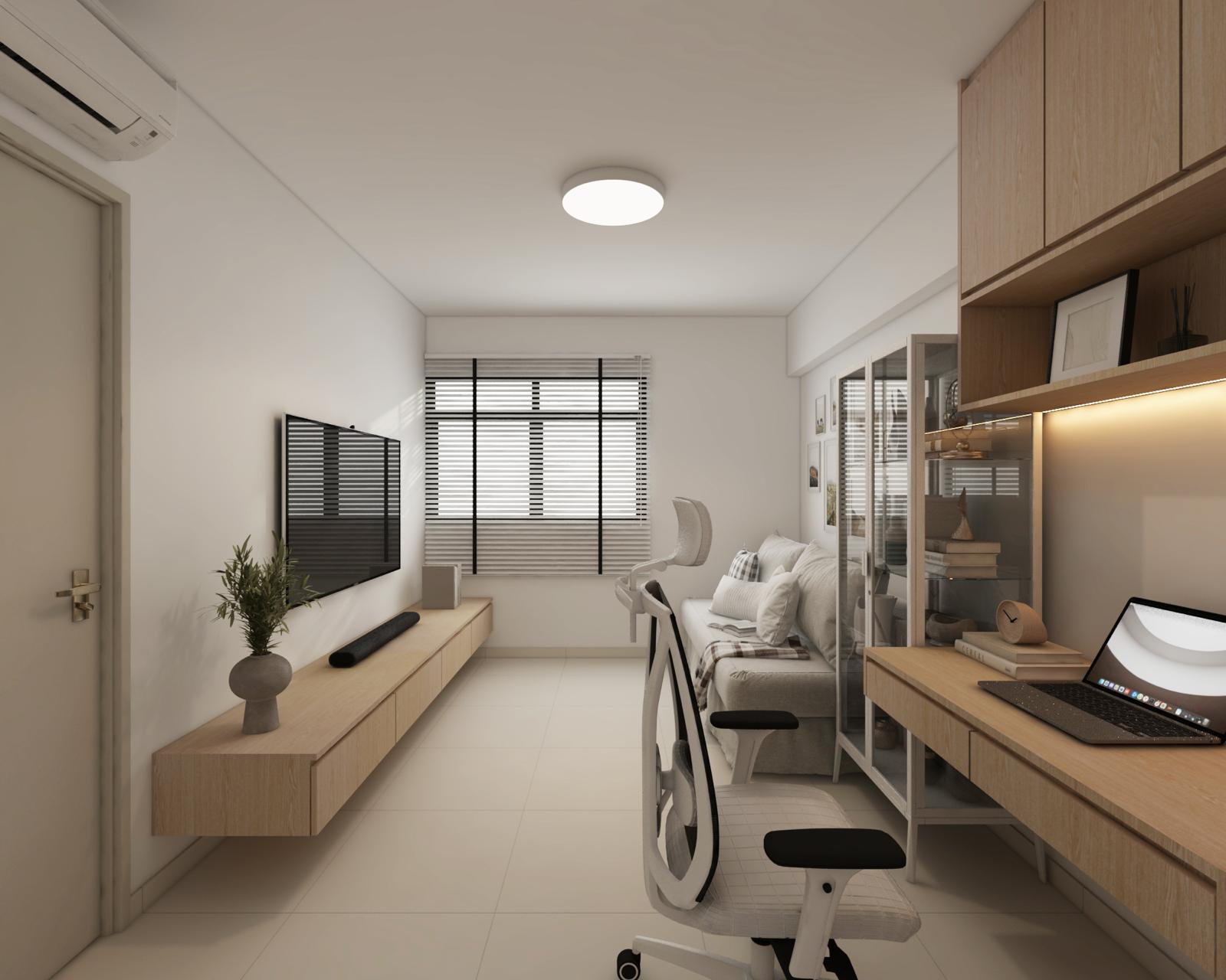
Curtains instead of blinds, like the ones in the reference video in G.2.
- 3.2
Not sure about reusing the glass cabinet, the top will collect dust. Could a glass display cabinet be built in next to the study table instead?
- 3.3
Is the study table being built? We thought we would be getting a standalone one.
- 3.4
We need a home for a lot of devices: router, modem, PS5, NAS, UPS and Nintendo Switch. They cannot go inside the TV console because they will overheat. Where do they live, with ventilation and cable access?
- 3.5
The printer currently sits on the TV console. It needs a place too.
Kids room
- 4.1
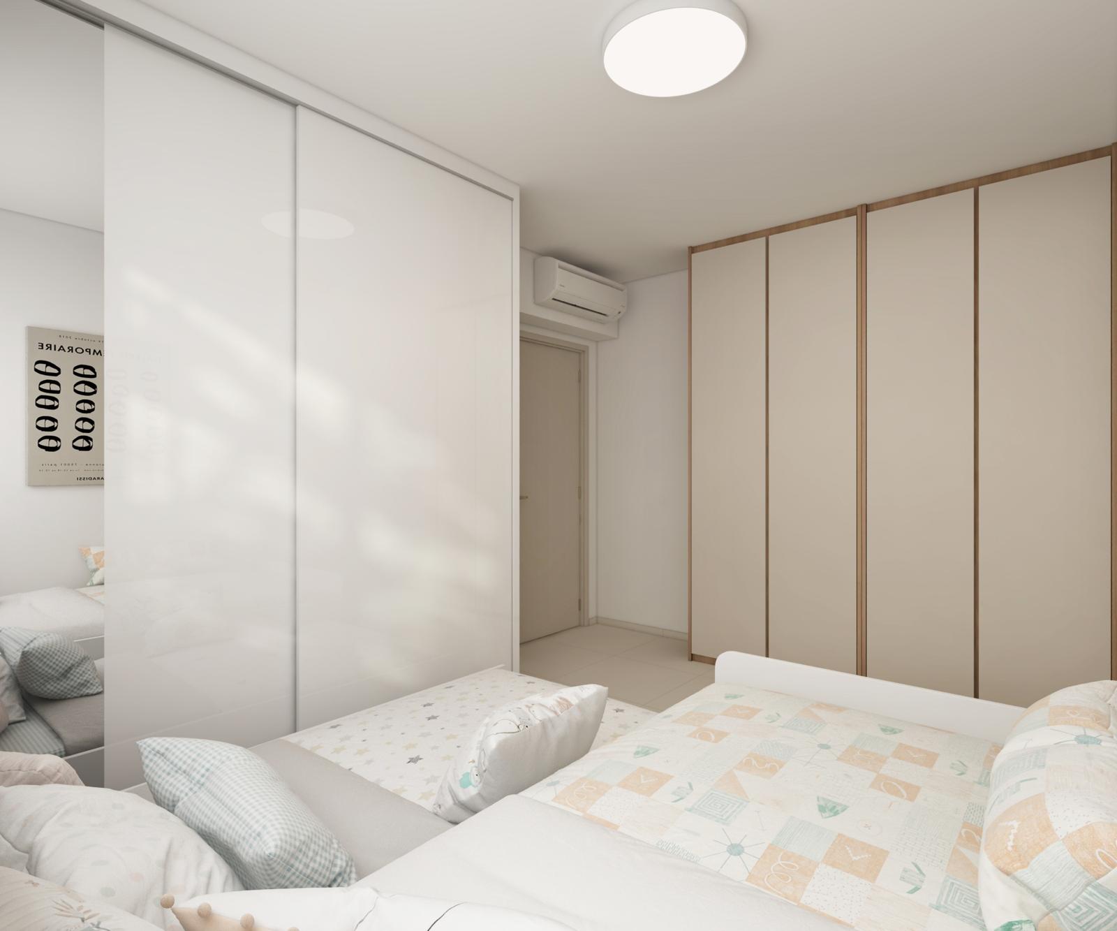
Both wardrobes feel too imposing and make the room claustrophobic. The render also leaves out the bunk bed, which stays, so the room will feel tighter still.
- 4.2
Instead of closed wardrobes all the way along, could one run be a floor-to-ceiling display cabinet for the boys' achievements and favourite artwork?
Across the whole flat
- G.1
The cabinets and the overall design feel boring and uninspired. We think we can afford more daring and interesting ideas.
We prefer a wabi-sabi feel over pure minimalism, and we think contrast matters: not everything the same tone. We want to play with curves, but not too much. In short, a balance of edges and curves, light and dark colours, natural texture and plain surfaces.
- The kind of curves we like, reel 1
- The kind of curves we like, reel 2
- Curved cabinet idea
- Cabinet handles as part of the design
- Reaching the top shelves, useful since we are building all the way up
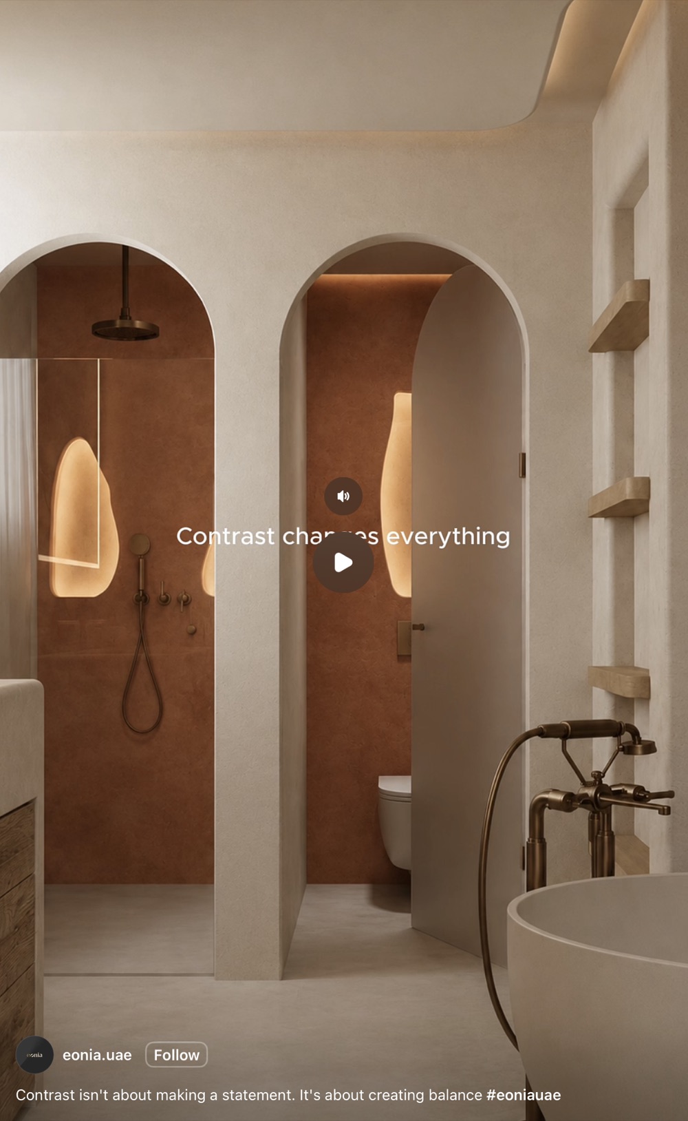
Contrast looks better than none: the terracotta inside the arches against the pale walls. - G.2
Reference video. Five things we like in this video:
- The statement tree (see 2.8).
- The curved feel around the walls and cabinetry.
- The curtains.
- The partition wall between living and dining, with two entryways through it.
- The natural-looking skylight effect, from 4:02.
- G.3
The entryway design is missing. We want a proper entryway. Two things it has to do:
- A place for the car keys.
- A better solution for shoes. The bottom of the shoe area should be open, so we can slip our daily pairs in and out without opening a door.
Entryway reel, nice design with open shoe space at the bottom of the cabinet.
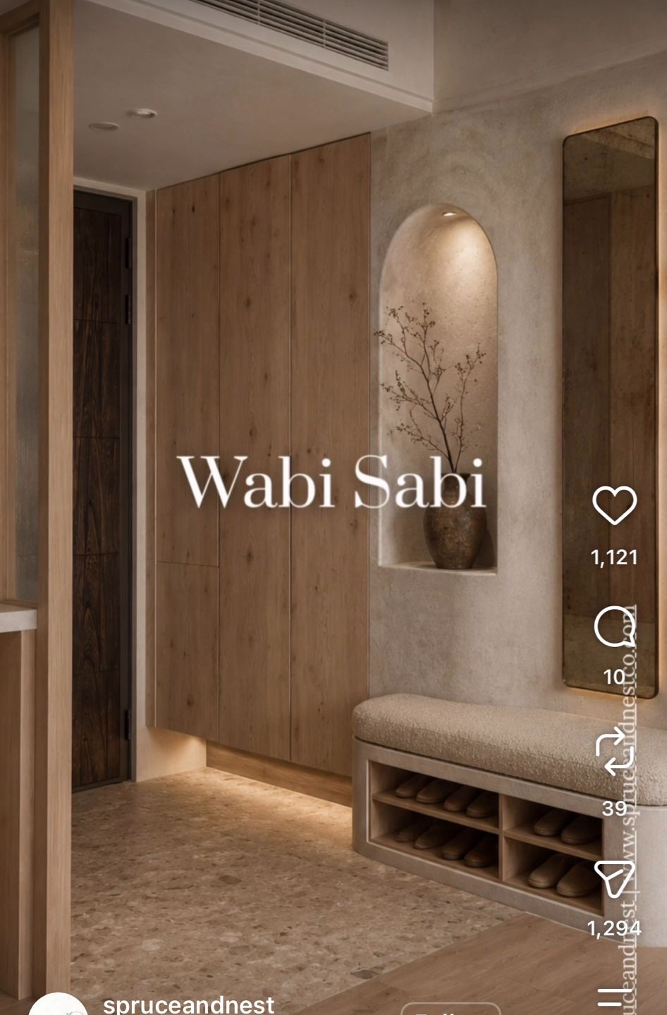
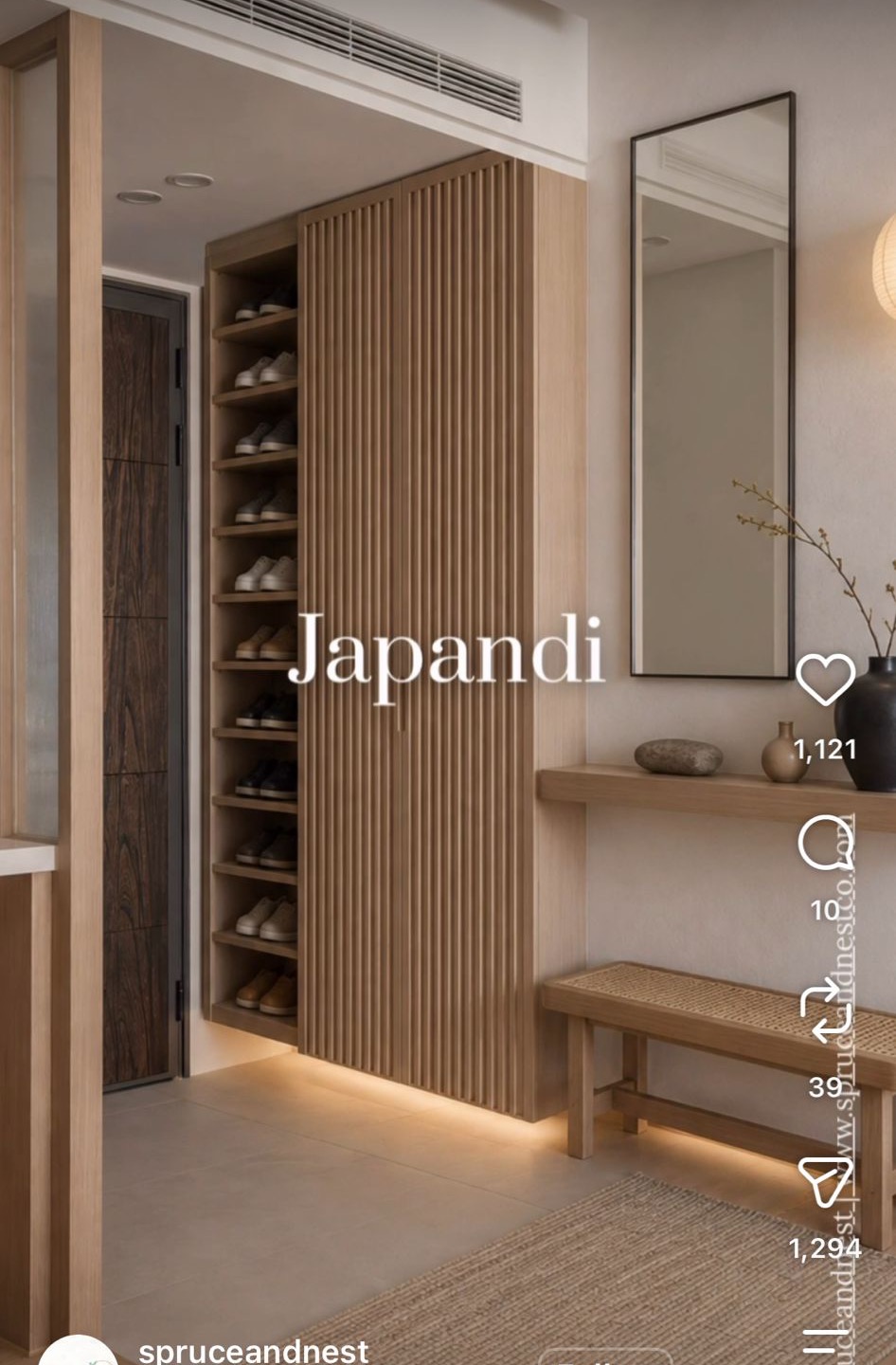
In both images we like the natural textures of the wabi-sabi look, from the wood tone to the limewashed wall.
Shoe rack ideas:
- Simple entryway in a tight corner with a shoe carousel, we like how functional it is
- Shoe rack reel
- Shoe rack idea 2
- Shoe rack idea 3
- Shoe rack idea 4
- G.4
- G.5
Example of the dining table we have in mind (see 1.3): a live-edge natural wood slab.
- G.6
The small awkward corner between the boys' room and the toilet. Ideas for what to do with a corner like that.
- G.7
Ways to obscure glass. Obscured glass reel, the stone-textured one looks the nicest.
Please help us make our house look beautiful and not basic!